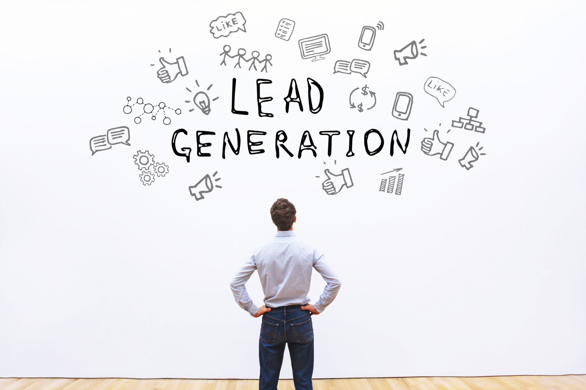
The goal of a good landing page is to attract more leads and increase conversion rates to boost business. It can be a home page or a standalone page created for a specific campaign, sale, or product.
But there is no such thing as the perfect Landing Page. However, if you want to increase your chances of developing high-converting landing pages, you can analyze what other marketers are doing and find ways to apply these insights to your own pages.
Check out 13 steps to creating effective landing pages!
Go for simplicity
Build a clean page with obvious navigation and no distractions. Provide all the information needed to encourage visitors to convert, but be aware that too much information can overwhelm them.
Consider which content is the most important and place it before the page scrolls, within the visitors’ direct line of sight. If necessary, add supplementary information below the page fold, as most users naturally know they can scroll down for more information.
Another way to provide more information, without overloading visitors with an excessive amount of text, is through videos. In the case of videos with sales arguments, it does not need to be long and complex. the best performing videos are between 30 seconds and two minutes.
Highlight value
Your landing pages need to have a specific target. To which audience will it communicate? Knowing this, tailor the communication to tell your target audience what they will gain from your offer. How does your product, content or service add value to the user? But don’t forget to keep the page appropriate to the company’s branding.
With this in mind, it will be easier to think of the ideal amount of text for your page, since there are cases that demand more content. For example, if you are offering a technology product at a high cost, your audience will probably expect to be able to review a comprehensive list of benefits or even a feature comparison with the competition.
Use clear text that stands out
The texts on your landing page need to be clear, to the point. It is salutary to use fewer paragraphs and more bulleted lists, for example.
And an important part of your landing page text is the title, since it is the first thing a visitor will notice about it. Some features present in titles that can help keep visitors on pages and generate more conversions are: use of numbers, four to nine words, division between title and subtitle, and clear intentions.
Examples of good titles:

This page from a UX tool used a short, straightforward title and if the visitor is inspired, they may make the click or scroll down the page for more information. And since it is a more inspirational title, it is important to keep the rest of the page text clear.
In the other example below, from Picture Marketing, the page has a title that doesn’t try to be clever, but makes it clear what the company has to offer.
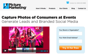
Both pages also choose to use subheadings.
Keep a cohesive message between landing page and ads
Since the ultimate goal of paid media work directed to a landing page is usually to promote conversion on the form, it is important that the landing page meets the expectations of those who clicked on the ads. Combine text content and design in both spaces.
Satisfied customers
In the case of product pages, it is also interesting to use “social validations” when creating landing pages. You can do this by including voices of satisfied customers to give authenticity to your offer. You can also humanize these testimonials by including personal data such as full names, job titles, place of residence, date of purchase, biographical data, portraits, or even video.
Use short forms
Resist the temptation to get as much user data as possible in a single form submission. You can use different fields on forms at each funnel stage to gather information gradually. That’s because the more fields you ask a visitor to fill out, the less chance they have of filling out the form and completing the desired conversion.
Include a privacy policy
The new data protection laws (LGPD, GDPR etc.) require that you make it clear to users how their data will be stored and handled. To meet this requirement when creating landing pages, you can use a checkbox field on the form for the user to accept that you use their data, and add a link to the company’s privacy policy where they can find more information on this issue.
Pay attention to your CTA
It is the CTA (Call to Action) that will promote the user’s final action, right? So you need to work it carefully. Pay attention to a few points:
- The bigger the better. Use large CTAs, because they need to be as visible as possible. And, if possible, use more than one CTA on the page;
- Give preference to the use of buttons. Users already expect the CTA to be a button. They know what to do when they see a button;
- Use a contrasting color for CTAs to the other colors on the screen;
- Do not use the word “send”. Create a persuasive CTA;
- Use visual cues, such as arrows or images of people looking at the button.
Work with relevant images
But, of course, we can’t just talk about the text on your landing page. Visual content is an essential component in creating landing pages that work.
When selecting and positioning your images, remember a few important points:
- Images must be of high quality;
- They must be relevant to your product or service. If you are selling a physical product, it is essential that your landing page contains an image of the product;
- If you are selling a service, the main purpose of the images should be to draw attention and demonstrate relevance to the visitor.
Be mobile-friendly and value speed
Ensure better campaign performance by designing a mobile responsive landing page. Layouts can be changed, CTAs can be made more visible, and images can be reduced or removed altogether. It is worth remembering that Google started indexing, in 2021, first the mobile version of a page before its desktop version, to adapt to the majority access characteristics of users.
Another important point, both for SEO and usability in general, is the loading speed of your landing page. 70% of consumers admit that loading time influences their desire to buy. If your pages are taking longer than 3 seconds to load on a mobile device, you will lose many potential customers. Avoid overloading your landing page with unnecessary elements that will slow it down.
Say “Thank You
Consider using a thank you page, which serves both to let users know that the form was indeed submitted and to engage them again.
On the thank you page you can ask if they would like to sign up for your newsletter, guide visitors to other related materials or products, provide additional information that would be a distraction on the landing page, or add links to other parts of your site, such as the company blog. The possibilities are many.
Always optimize
Successful landing pages are often those that have required the most tweaking and optimization. Make a habit of continuous analysis, study your metrics, research best practices, and optimize your page for the best results.
Make it possible to contact
Don’t forget to include in the landing page ways for the user to contact your company. A phone number, physical address, email, or contact form are some of the options. Some landing pages even feature a customer service bot, which helps to strengthen the trust between users and brand.
Want to know more about how to use all these elements in practice to create landing pages and attract more leads? Contact Agência Vision and count on our partnership. ?

![Discover how Inbound Marketing works and how to use it professionally to generate authority, share knowledge, and capture leads. C ith time, the way we do some things changes, gaining new insights and more current approaches. This natural updating of things applies to many different spheres. It has happened and is happening right now. We […]](https://agencia.vision/wp-content/uploads/2019/12/iStock-846841846-255x200.jpg)
social vision