
Client: FC Cloud
Project: Brand redesign.
Solutions: Vision was asked to develop a visual identity that could solve a recurring challenge for the company: the noise between its visual communication and the verbalization of its name.
OmniK is an established company in the technology sector and has in its portfolio successful cases, such as Centauro and Ativo Store. With an innovative mindset, the company considers technological platforms as one of the fundamental pillars for the digital transformation of markets. And that is why it offers innovative solutions and products to make the transition of companies into high-performance marketplaces.


CHALLENGE:
Even being recognized for its high quality and innovative solutions, OmniK had a visual identity that was not very well interpreted. The composition of the fonts used in its visual communication caused a reading noise. And, for this reason, the public and potential customers had difficulties in understanding its essence and verbalizing its name.
STRATEGY:
To create a clear and objective visual identity for the brand, but with one very important point: that the brand update would not interfere with the essence and values of the company so strongly established.


SOLUTION:
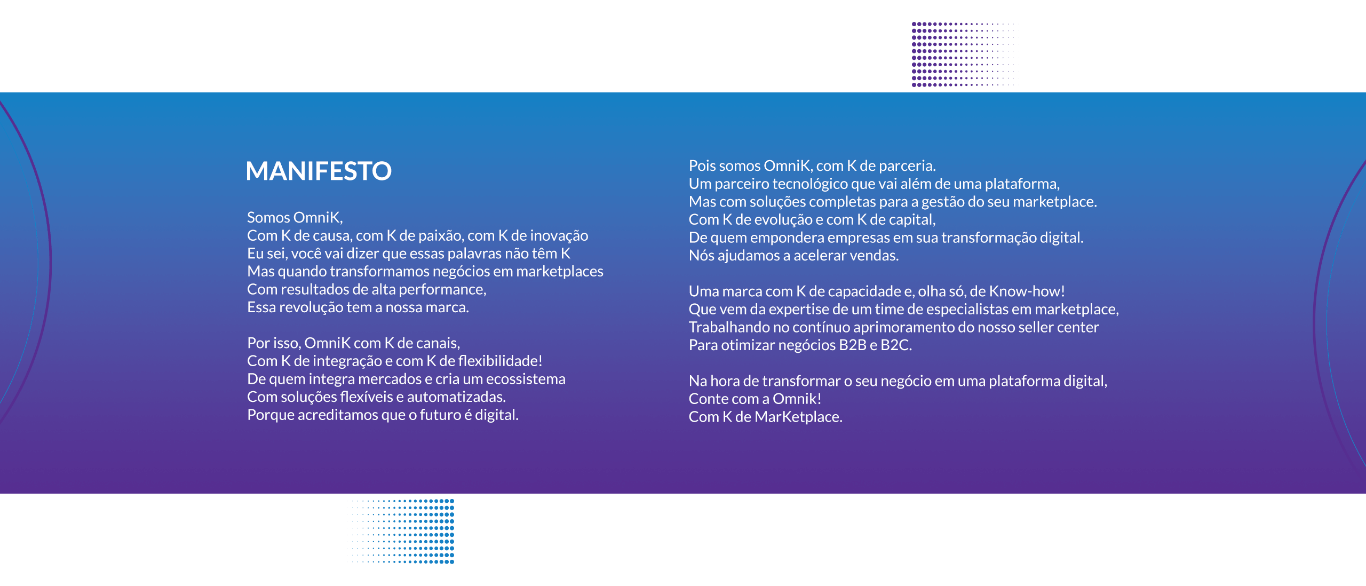
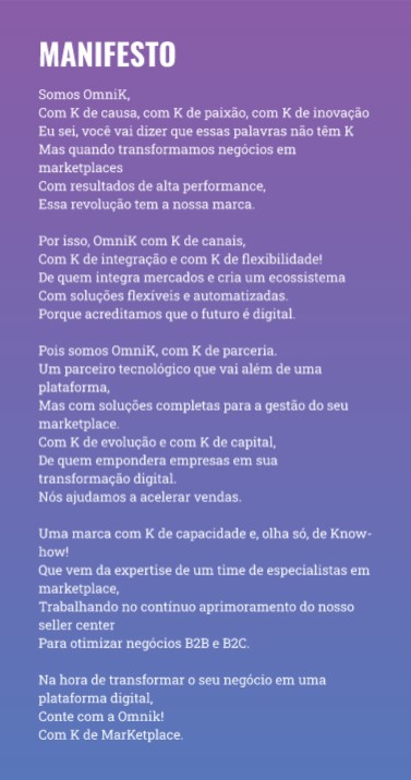
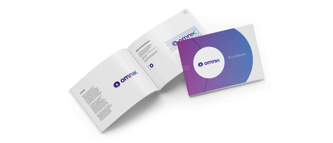
Developed from the concept “Omni”, a symbology was created in interconnected circles that referred to the dynamism of an omnichannel service. The colors selected allude to technology, wisdom and security. The iconography represents the integration of two worlds: the customer who seeks a marketplace and the digital transformation offered by the company. To solve the difficulty of verbalizing the name, the letter “K” was applied in the name with a different tone and in a way that stood out and was pronounced separately.




OUTCOME:
The client’s pains have been solved, and the new design is now easy to assimilate and its phonetics pronounced correctly.


social vision